Download de presentatie
De presentatie wordt gedownload. Even geduld aub

1
Robbert Ritmeester 2 juni 2009 Widgets Design voor kleine schermen Testen van mobiele apps

2
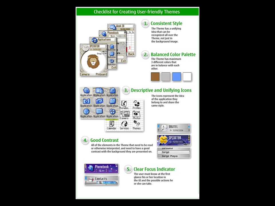
What are Widgets? Widgets zijn lichtgewicht applicaties die gebruik maken van informatie op het web. Gadget, badge, module, webjit, capsule, snippet, mini, flake Miljoenen developers zijn vertrouwd met de webtechnologie: HTML, CSS en Javascript Twee widgets kunnen beter zijn dan één Open, scan de informatie en sluit – met een simpele optie om de settings te wijzigen.

3
Niet: Camera Contacten GPS Wel: HTML CSS Javascript Minder device fragmentation Widget

4
Camera Contacten GPS Applicatie Device fragmentation

5
Camera Contacten GPS Device fragmentation Browser API* API • Application programming interface, een verzameling definities waarbinnen computerprogramma's met elkaar communiceren ( routines, data structures, object classes and/or protocols provided by libraries and/or operating system services in order to support the building of applications.routinesdata structures object classesprotocols librariesoperating systemservices Adobe Integrated Runtime (AIR) is a cross-platform runtime environment for building rich Internet applications using Adobe Flash, Adobe Flex, HTML, or Ajax, that can be deployed as a desktop application.cross-platformruntime environmentrich Internet applications Adobe FlashAdobe FlexHTMLAjaxdesktop application
 is a cross-platform runtime environment for building rich Internet applications using Adobe Flash, Adobe Flex, HTML, or Ajax, that can be deployed as a desktop application.cross-platformruntime environmentrich Internet applications Adobe FlashAdobe FlexHTMLAjaxdesktop application")
7
Tutorial Betavine http://www.betavine.net/bvportal/resources/wi dgets/widgettutorial Artikel MobileCowboys http://www.mobilecowboys.nl/services/9667

8
Design

9
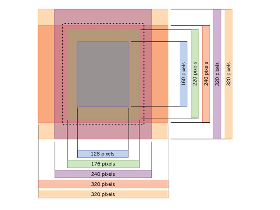
Beeldformaat PDA HP iPaq 320 x 240 N95 320x 240 maar is toch kleiner HTC Touch 3G is ook 2240 x 320 Samsung Omnia 240 x 400 Iphone 320 x 480 Palm Pre 360 x 480 Nokia N5800 XpressMusic 360 x 640 Sony Ericsson Xperia X1 480 x 800

10
Een desktop van 1024 x 768 pixels heeft een pixel density van zo’n 85 ppi (pixels-per-inch). Netbooks zoals de Asus Eee PC 900 heeft een scherm van 9 inch diagonaal waar 1024 x 600 pixels in zitten en heeft daarmee een dichtheid van 133 ppi. Apple iPhone heeft een schermresolutie van 320 x 480 pixels en een 3.6" diagonaal beeldscherm: 160 ppi. Nokia E60 heeft een schermresolutie van 416 x352 pixels en een 2.2" diagonaal beeldscherm: 240 ppi Het onderstaande plaatje laat dezelfde afbeelding van 100 x 100 px zien op devices met pixel densities van 72, 144 en 240 ppi Calculator

12
Kleurdiepte N95 24 bit HTC Touch 3G is ook 216 bit Samsung Omnia 12 bit Iphone 16 bit Palm Pre 24 bit Nokia N5800 XpressMusic 24 bit Sony Ericsson Xperia X1 16 bit Device Atlas

15
Twee ontwerpen voor alle toestellen met autorotate Landscape Portrait

16
Use simple, readable fonts. For on-screen reading, sans serif fonts, such as Arial and Helvetica, are the best. Do not use small fonts. Remember that the application may be used under conditions in which reading text is difficult or by users with small visual impairments. Limit the number of font sizes, styles, and weights, and be consistent with the fonts used. This helps the user learn the application and aids readability. Lettertype

17
Nokia Device Font Series 60

18
Devicefont: Helvetica http://daringfireball.net/misc/2007/07/iphone- osx-fonts IPhone Tekst in Photoshop

19
Materiaal\key_3.fla Adobe Device Central

20
Selecteer één toon (tint, kleur) Varieer met de Saturartion en de Brightness zodat een harmonisch thema ontstaat zoals ‘koud’, ‘warm’, of neutraal Eén toon BUITEN TESTEN !
 Varieer met de Saturartion en de Brightness zodat een harmonisch thema ontstaat zoals ‘koud’, ‘warm’, of neutraal Eén toon BUITEN TESTEN !")
21
Harmonische combinatie van kleuren die dicht bij elkaar liggen Eén toon

22
Complementaire kleuren liggen tegenover elkaar op de kleuren cirkel Complementaire kleuren BUITEN TESTEN ! Zo moet het dus niet!

23
• Maak een duidelijk onderscheid tussen waar je wel en niet op kan klikken • Stylis of touch-screen niet door elkaar gebruiken • Touchscreen knoppen van min. 8 x 8 mm • Hotspot mag groter zijn dan de grafische knop: Knoppen BUITEN TESTEN !

24
Focus • De achtergrond moet minder gedetailleerd zijn dan de voorgrond. (o.a vanwege zonlicht) • Nadruk op de voorgrond • Voorgrondelementen met border of schaduw • Duidelijke focus BUITEN TESTEN !
 • Nadruk op de voorgrond • Voorgrondelementen met border of schaduw • Duidelijke focus BUITEN TESTEN !.")
25
Focus BUITEN TESTEN ! Zo moet het dus niet!

26
BUITEN TESTEN ! Zo moet het dus niet!

28
Testen Veel!

30
Zo moet het dus niet!

31
Wat is anders? • De gebruiker wordt waarschijnlijk afgeleid Stapt in de trein; moet op het verkeer letten, binnekomend telefoontje enz. Zorg ervoor dat de gebruiker zijn taak snel kan uitvoeren of kan onderbreken (mededelingen blijven op het scherm staan totdat de gebruiker weer reageert. • Het invoeren van tekst is onhandig(er). Zelfs als een mobile device een QWERTY keyboard heeft. Laat de gebruiker keuzes maken ipv invoeren. • Klein scherm ppi (pixels-per-inch) – storend licht enz.. • De context van de gebruiker Omgevingsgeluid, hard licht, in een restaurant of concertgebouw, enz
. Zelfs als een mobile device een QWERTY keyboard heeft. Laat de gebruiker keuzes maken ipv invoeren. • Klein scherm ppi (pixels-per-inch) – storend licht enz.. • De context van de gebruiker Omgevingsgeluid, hard licht, in een restaurant of concertgebouw, enz.")
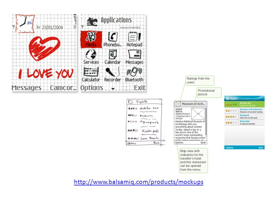
32
http://www.balsamiq.com/products/mockups
33
• Satisfaction Anonymous questionnaire • Efficiency Time to perform certain task(s) • Learnability Time to reach certain stage(s) • Errors Number of errors, while using a system, in certain task(s)
 • Learnability Time to reach certain stage(s) • Errors Number of errors, while using a system, in certain task(s)")
34
Evaluatie mobile interaction design A design solution can be critically evaluated by asking the following set of questions: 1.Does the application allow fulfilling the main user tasks efficiently? 2.Is the navigation model clear and intuitive and consistent? 3.Is information and content presented clearly? 4.Is the language and terminology familiar to the user and used consistently throughout the application? 5.Are controls used consistently within the application and in relation to the platform style? 6.Does the application provide relevant feedback to the user? 7.Is information entry made as easy as possible? 8.Does the application guide the user and provide help if necessary? 9.Does the application cope well with error situations: are they easy to understand and can the user recover easily? 10.Is the design simple and desirable – does it include everything necessary but nothing extraneous?

35
1. Requirements definition The concept is defined and tested. Some critical element of the application idea may need to be modified or the entire concept abandoned. Expert analysis: Find out and correct critical flaws in the concept. Competitive analysis: Study how users are currently using competitive products. User and task analysis: Find out if users are interested to use and buy the product. 2. Design and implementation Functional, technical, and usability specifications for the implementation are defined. This phase is returned to multiple times after the testing phase, until the product meets the requirements set for it. Usability design: Use guidelines and checklists to verify that the implementation does not violate existing standards. Use design templates to avoid common problems. Expert analysis: Evaluate prototypes on how to improve the user interface and avoid problematic designs. Individual or group usability testing: Testing paper prototypes or actual product prototypes with real users. Consulting: Avoid delays in the development process by consulting usability experts on specific areas. 3. Testing The system is tested thoroughly to make sure it meets the requirements set at the beginning of the process. It is very important to conduct also system-level testing, that is, testing also installation, deployment, and configuring the application. Expert analysis: Make sure the user interface is functional, without severe flaws and receive improvement suggestions. Individual usability testing: Find out how real end users use the application and where they have problems. Group usability testing: The interaction between users is tested. Results may be surprising and users may find ways to cause errors in the application. 4. Release to the public. Research is needed to find out about user acceptance, and what functional, technical, or usability components can be added or improved for future releases. Satisfaction survey: Receive statistical information on which parts of the application users like and which need improvement. In addition, the effects of possible usability problems can be evaluated. User analysis: See how well the product fits into the user group for which it was intended. 5. Maintenance The product may require changes or updates, different language versions, or porting to new devices. Group testing: How would users modify the application? What would prompt them to update or buy another version? Satisfaction survey: Competition may affect users' attitudes and requirements. In addition, the users have had a longer time to evaluate the application. User and task analysis: See how well the product fits into the user group for which it was intended.

36
Toverwoorden X - Nu - Hier - Ik -De ander -Vragen - Werk - Onderweg - Winkel - Thuis - Wachten

Verwante presentaties


![Deltion College Engels C1 Spreken [Edu/003] thema “Oprah at Deltion” can-do : kan duidelijke, gedetailleerde beschrijving geven van complexe onderwerpen,](/8/2033280/big_thumb.jpg "Deltion College Engels C1 Spreken [Edu/003] thema “Oprah at Deltion” can-do : kan duidelijke, gedetailleerde beschrijving geven van complexe onderwerpen,>")


![Deltion College Engels C1 Gesprekken voeren [Edu/002]/ subvaardigheid lezen thema: Order, order…. can-do : kan een bijeenkomst voorzitten © Anne Beeker.](/8/2048322/big_thumb.jpg "Deltion College Engels C1 Gesprekken voeren [Edu/002]/ subvaardigheid lezen thema: Order, order…. can-do : kan een bijeenkomst voorzitten © Anne Beeker.>")


